Top Female Alpine Ski in World Cup
title image reference
title image reference
Introduction
This site presents a data-focused look at elite women's alpine skiing using competition history to understand long-term performance and competitive dominance. Rather than treating results as isolated moments, the project emphasizes patterns that emerge across seasons and careers, while also drawing attention to the role of national affiliation in shaping competitive trajectories.
As the 2026 Milano Cortina Winter Olympics approach, this site explores how past World Cup performance may help frame expectations around medal potential and competitive strength. By situating individual results within a national context, the project invites users to consider probability, consistency, and momentum as key factors influencing future outcomes.
Original Dataset
The original dataset is shown below in two tables: one for players and one for nations. This layout keeps the source data visible before the charts.
| Overall Crystal Globes | Racer | Nation | Total Crystal Globes | Wins | Podiums |
|---|---|---|---|---|---|
| 6 | Annemarie Moser-Pröll | AUT | 16 | 62 | 114 |
| 5 | Mikaela Shiffrin | USA | 16 | 101 | 157 |
| 4 | Lindsey Vonn | USA | 20 | 82 | 138 |
| 3 | Vreni Schneider | SUI | 14 | 55 | 101 |
| 3 | Janica Kostelic | CRO | 6 | 30 | 55 |
| 3 | Petra Kronberger | AUT | 4 | 16 | 35 |
| 2 | Katja Seizinger | GER | 11 | 36 | 76 |
| 2 | Lara Gut-Behrami | SUI | 9 | 48 | 101 |
| 2 | Michela Figini | SUI | 8 | 26 | 46 |
| 2 | Anja Pärson | SWE | 7 | 42 | 95 |
| 2 | Erika Hess | SUI | 7 | 31 | 76 |
| 2 | Federica Brignone | ITA | 7 | 37 | 85 |
| 2 | Maria Walliser | SUI | 6 | 25 | 72 |
| 2 | Hanni Wenzel | LIE | 5 | 33 | 89 |
| 2 | Anna Veith Fenninger | AUT | 4 | 15 | 46 |
| 2 | Nancy Greene | CAN | 4 | 14 | 20 |
| 1 | Renate Goetschl | AUT | 9 | 46 | 110 |
| 1 | Michaela Dorfmeister | AUT | 6 | 25 | 64 |
| 1 | Maria Riesch Hoefl | GER | 6 | 27 | 81 |
| 1 | Lise Marie Morerod | SUI | 6 | 24 | 41 |
| 1 | Tamara McKinney | USA | 4 | 18 | 45 |
| 1 | Petra Vlhova | SVK | 3 | 31 | 73 |
| 1 | Tina Maze | SLO | 3 | 26 | 81 |
| 1 | Marie Therese Nadig | SUI | 3 | 24 | 57 |
| 1 | Anita Wachter | AUT | 3 | 19 | 75 |
| 1 | Alexandra Meissnitzer | AUT | 3 | 14 | 44 |
| 1 | Pernilla Wiberg | SWE | 2 | 24 | 61 |
| 1 | Nicole Hosp | AUT | 2 | 12 | 57 |
| 1 | Rosi Mittermaier | GER | 2 | 10 | 41 |
| 1 | Michelle Jacot | FRA | 2 | 10 | 21 |
| 1 | Gertrud Gabl | AUT | 2 | 7 | 17 |
| Nation | FIS Nation Code | rank | pts |
|---|---|---|---|
| Austria | AUT | 1 | 6971 |
| United States of America | USA | 2 | 2916 |
| Sweden | SWE | 3 | 1892 |
| Italy | ITA | 4 | 1814 |
| Switzerland | SUI | 5 | 1706 |
| Canada | CAN | 6 | 1297 |
| France | FRA | 7 | 1241 |
| Germany | GER | 8 | 1239 |
| Finland | FIN | 9 | 774 |
| Czechia | CZE | 10 | 567 |
| Slovenia | SLO | 11 | 448 |
| Croatia | CRO | 12 | 331 |
| Slovakia | SVK | 13 | 323 |
| Great Britain | GBR | 14 | 233 |
| Liechtenstein | LIE | 15 | 119 |
| Spain | SPA | 16 | 114 |
| Norway | NOR | 17 | 111 |
| Poland | POL | 18 | 70 |
| Monaco | MON | 19 | 52 |
| Serbia | SRB | 20 |
Charts
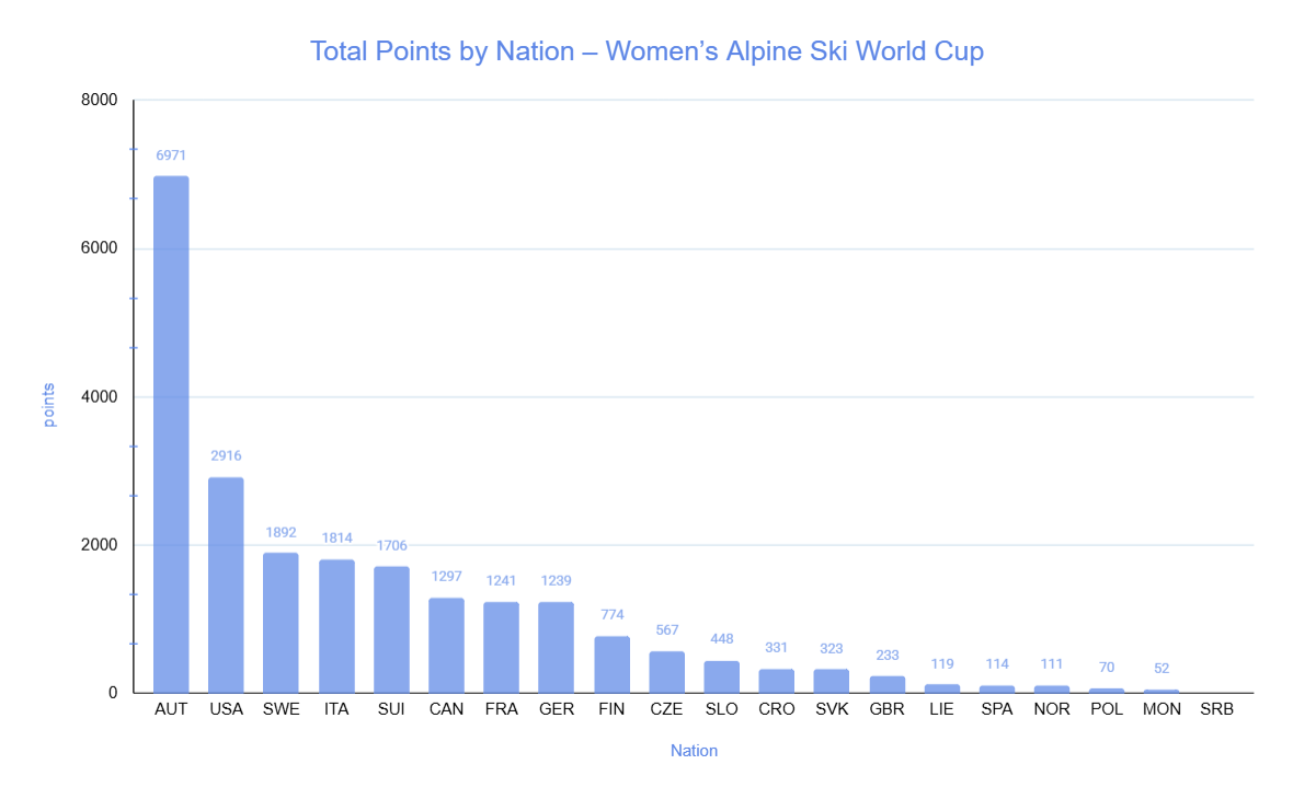
This chart clearly compares total points across nations, making it easy to identify dominant countries such as Austria and the United States. The use of a bar chart is effective because it allows for direct comparison of values across categories with clear visual differences in height. However, the large gap between top and lower-ranked nations compresses smaller values, making it harder to distinguish differences among lower-performing countries.
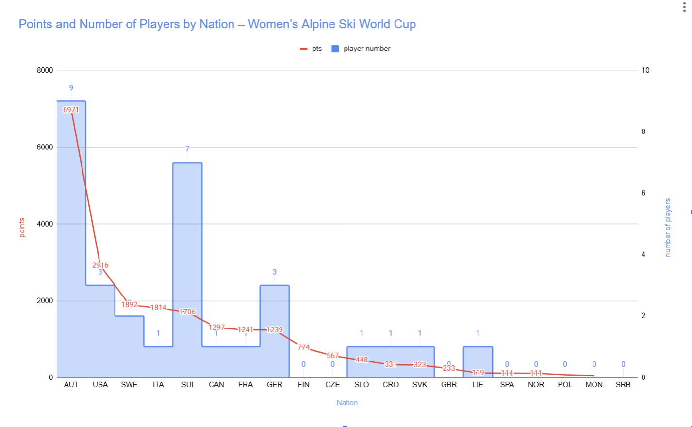
This chart combines total points and player counts, allowing viewers to compare performance and team size simultaneously. The dual-axis design is effective because it reveals whether national success comes from a few top athletes or a broader group of competitors. However, using two axes may be slightly confusing for viewers, as it requires careful attention to distinguish between the scales of points and player numbers.
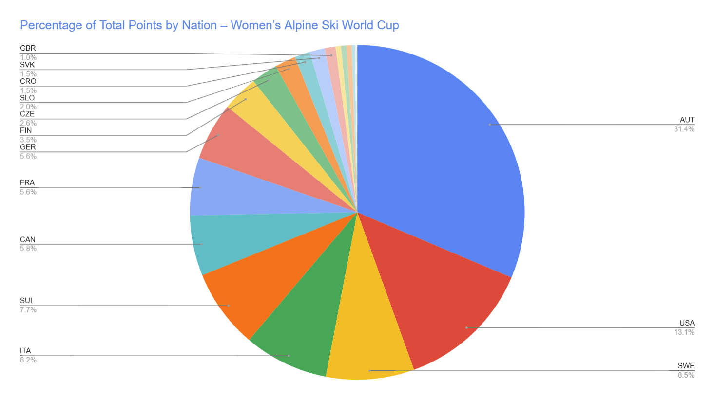
This chart visualizes the proportional distribution of total points across nations, highlighting how much each country contributes to the overall total. It is effective in showing dominance, as Austria occupies a noticeably large share compared to others. However, pie charts make it difficult to compare smaller segments accurately, especially when many countries have similar or very small percentages.